Today we're making area and relative area graphs available for our dashboards to help you display data in new ways.
If you've visited the "performance graphs" page for your app on AppSignal.com, you have seen the "event graphs". These graphs depict event durations such as Database calls and HTTP requests.
Starting today we're making available the display key in our dashboard YAML syntax, allowing you to display (custom) metrics as area charts.
Syntax
The display option accepts three values:
LINEfor line charts. (This is the default value.)AREAfor area charts.AREA_RELATIVEfor relative area charts.
In the dashboard YAML it would look like this:
1title: Event details
2graphs:
3 - title: Received/transmitted LINE
4 display: LINE
5 format: number
6 metrics:
7 - name: event_details_received
8 fields:
9 - COUNTER
10 - name: event_details_emitted
11 fields:
12 - COUNTER
13 - title: Received/transmitted AREA
14 display: AREA
15 format: number
16 metrics:
17 - name: event_details_received
18 fields:
19 - COUNTER
20 - name: event_details_emitted
21 fields:
22 - COUNTER
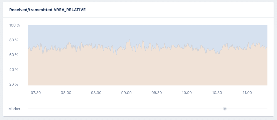
23 - title: Received/transmitted AREA_RELATIVE
24 display: AREA_RELATIVE
25 format: percent
26 metrics:
27 - name: event_details_received
28 fields:
29 - COUNTER
30 - name: event_details_emitted
31 fields:
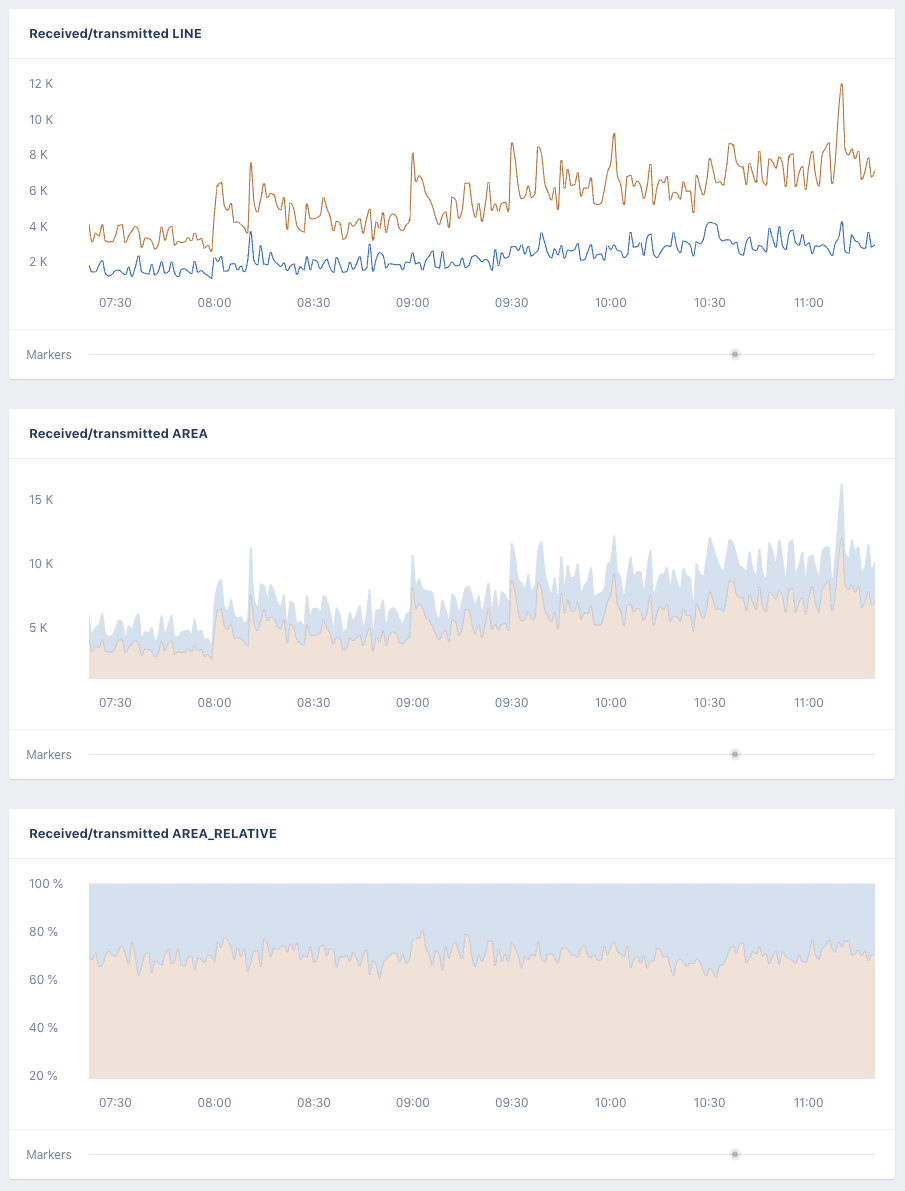
32 - COUNTERThis dashboard YAML would generate the following charts for these metrics:
Use cases
The AREA_RELATIVE is a convenient way to compare values over time against each other. In the three graphs above you can see in the LINE and AREA charts that the values of both measurements has increased a lot over time. But it's hard to see how the values compare against each other.
The AREA_RELATIVE display option converts the values to a percentage and shows that while the value of both measurements has increased, but relative to each other they have stayed the same.
You can now take an existing graph and edit it (by clicking the edit button on the right top of a page with graphs) and change a graph type by changing the display field for that graph in the YAML. You can read more about these graphs and how to use them in custom dashboards on our documentation page.
Let us know how you're using area and relative area charts to display data from your app!