From good to better
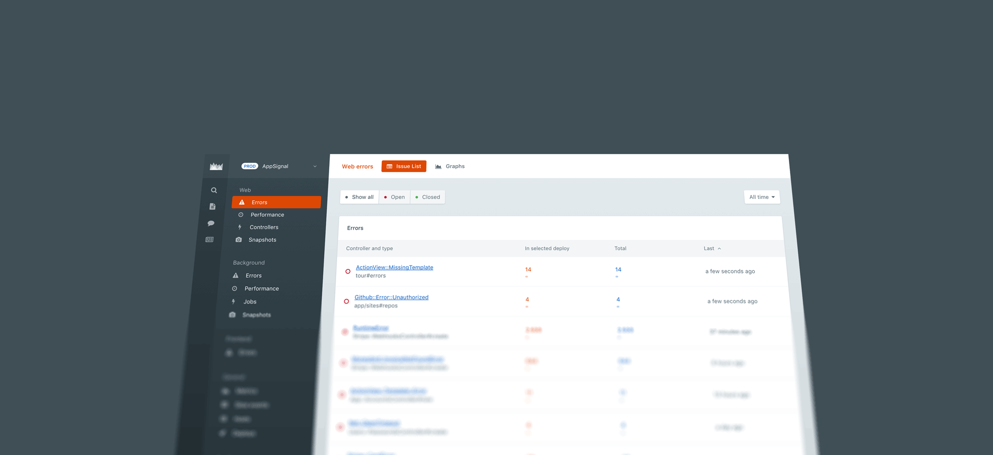
We are always working to create the best possible experience for our users. The new layout we shipped today is a step forward that will make AppSignal easier to use.
Our user interface has always been a strong part of our product. We keep it clean and focused by sometimes making tough choices to avoid complexity.
Over time you can evolve your design while adding small features. But sometimes you need to look at the big picture and consider what your product has become – and what you want it to become.
New layout structure
The information architecture was not optimal. In the old structure, organization settings, headings, navigation and content were not hierarchic, but rather spread out over the screen.
The new layout is easier to understand, with hierarchy being built from left to right.
The new title and tab bar
The new page header combines the title and tabs into one. It saves us a lot of space vertically. It also removes the large colored heading bar, which gives us the opportunity to use more color in the content without it becoming a carnival.
Flexbox & CSS refactor
We fixed visual inconsistencies that snuck into our previous design. We refactored our CSS mixins, placeholders and variables to be much cleaner.
We are building a tool for developers, which gives us the luxury to only support the latest browsers. Therefore we could optimize much of our layout with flexbox.
Small changes
- We now only use system fonts, which decreases loading times and respects your OS's defaults.
- Your site settings menu is now less prominent in the sidebar navigation.
- The docs, chat and changelog are now directly accessible through the sidebar navigation.
- We have added the AppSignal icon again as your beacon of hope. Oh, and of course you can click it to go to your account overview.
- Your profile and settings have a more logical place in the navigation.
Let us know what you think
We hope you like it. We've been using it ourselves for a couple of weeks, and we couldn't wait to show you. We've done our very best to hash out any browser compatibility issues. If you do find something, email us and we'll send you some of our great stroopwafels.
