We're launching a big update for the custom metrics dashboards. We combined dashboards and custom metrics in the navigation, improved the dashboard editor and updated the dashboard definition YAML.
Combining dashboards and custom metrics
The "Dashboard" and "Metrics" sections had grown so similar, it made sense to combine them in the navigation. All dashboards will now appear together in the sidebar as per our recent navigation change.
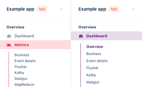
Left old, right new navigation.
Enhanced editor
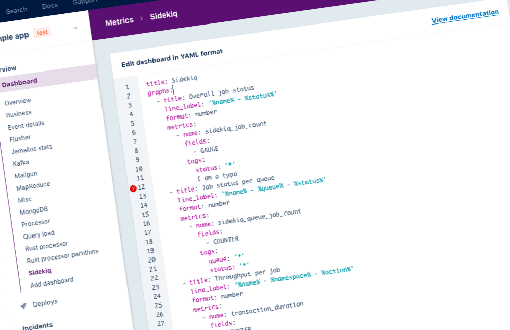
Before today, all your dashboards were editable in one big YAML definition. This YAML became too large to easily manage in our online editor as the number of dashboards increased for an app. It was difficult to keep focus on which dashboard the YAML belonged to and syntax errors were difficult to spot.
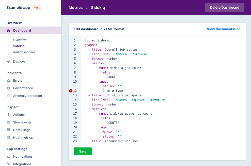
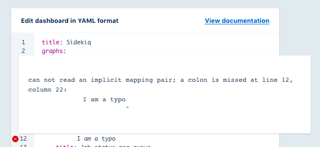
The dashboard editor is now scoped per dashboard. This keeps focus on the dashboard that's being created or updated. We've also outfitted the editor with new features such as syntax highlighting and better validation so it's easier to track down where an error is coming from.
The new one is so much better, we're scared to show you the 'before' image 😉
Updated dashboard definition YAML
In order to support more features now, and in the future, we have made some changes to the YAML format of the dashboard definitions. Don't worry, we've updated all your existing dashboards to the new format automatically. There's no need to update these yourself.
The new format is explained in detail on our dashboards definition YAML documentation page.
These are some notable changes in the format:
- The data on which the lines in a graph are based are now grouped under the
metricskey on every graph. This makes it easier to configure fields and tags per metric. - We've combined the old
fieldsandfilterkeys into thenamekey on themetricsitems. This still supports the wildcards from thefilterkey like before:name: 'my_metric_*_key'. - The
kindkey has been renamed tofields. (Thekindkey was an old name we used forfields.) This now accepts an array of fields which makes it easy for measurements to show the mean, 90th percentile and 95th percentile in the same graph.
1# Old YAML definition
2title: 'Example dashboard'
3graphs:
4  -
5    title: 'Query duration'
6    line_label: '%namespace% - mean'
7    format: duration
8    kind: measurement
9    fields:
10      - query_duration
11    headerType: legacy
12tags:
13      namespace: "*"
14
15# New YAML definition
16title: 'Example dashboard'
17graphs:
18  -
19    title: 'Query duration'
20    line_label: '%namespace% - %field%'
21    format: duration
22    metrics:
23      -
24        name: query_duration
25        fields:
26          - MEAN
27          - P90
28          - P95
29        headerType: legacy
30tags:
31          namespace: "*"
We think these changes make it easier to edit the custom metrics dashboards and customize them even more! Let us know if and how we can do even better!
If you have feedback about this or any other feature, want to suggest changes or share something you like, please let us know. Your input is extremely valuable to us!