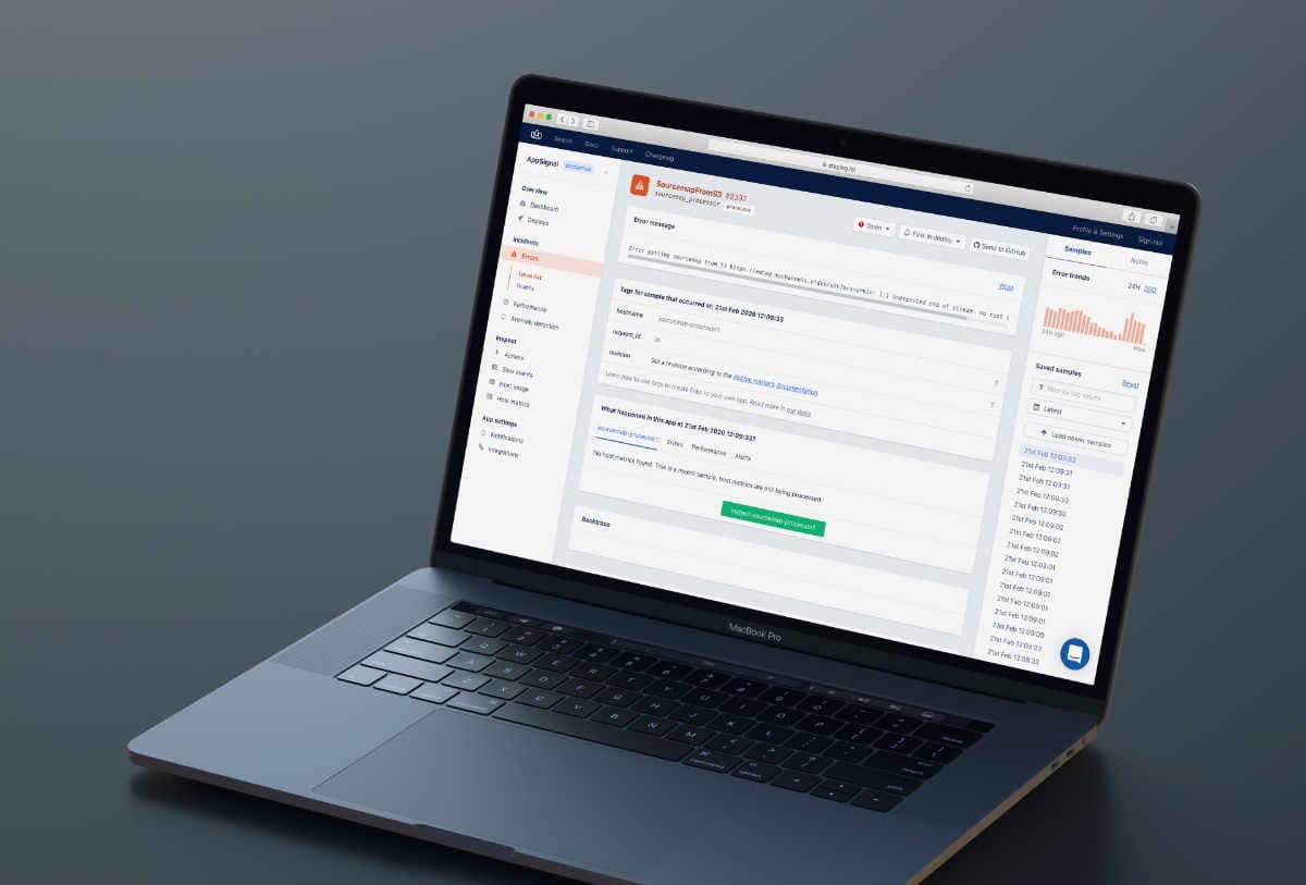
Today, we're bringing you an update of the performance/exceptions sample page. This update includes a number of improvements that will help you navigate and filter the available samples faster and more smoothly.
We're bringing these changes as an iteration of sample navigation improvements that we launched a while ago. We received valuable feedback from our users: the overlay made the navigation choppy instead of fluent. Quick fixes were made, but we were eager to make the core of our product better.
Improved Use of Space and Smoother Navigation
The new page header design will be the first change you notice. We moved the action buttons (issue state, notification frequency, integrations) from the sidebar to the page header.
This new header gave us more room on the sidebar, which we redesigned from the ground up. Here are the changes and improvements made to the sidebar:
Exception/Performance Trends
You'll still recognize the graph with exception trends for the last 24 hours / 30 days. We've added a similar graph to the performance page with the mean and 90th percentile response times.
Filter Samples
The new filter helps you find the right samples. Enter the value of a tag and you'll only see samples with that tag value. It's easy to filter by revision, user ID, or any custom tag you've added (Ruby / Elixir / JavaScript).
Quick-filter
Each tag value in the main part of the sample page now has a quick link (the filter icon). This allows you to quickly filter the samples by that value.
Jump to Date
A "jump to" option enables you to find samples around a specific moment in time.
Sample List
The sample list provides a timeline of all your saved samples. You can load newer or older samples with the buttons at the top and bottom of the list.
Sidebar State Stays Throughout Navigation
We keep the sidebar state intact when you navigate through different samples. This makes going back and forth between samples quicker and smoother.
Notes
On the second tab of the sidebar, you'll find the "Notes" feature. You can conveniently leave notes for other team members that give context on what caused an exception or a slow request, or how you fixed it last time.
We've received amazing initial feedback from some beta testers. We're happy to ship these improvements to all AppSignal users today. Let us know if you have any thoughts or feedback to make it better.
One of the next planned improvements is the information hierarchy (and visual display) of the samples. Shoot us an email.
